Branding for a fried chicken restaurant chain
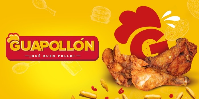
Guapollón is a chain of fried chicken restaurants in the eastern part of El Salvador, which offers both take-out and lunch options. It is one of the few options that exist in that area.
The Pepper Challenge
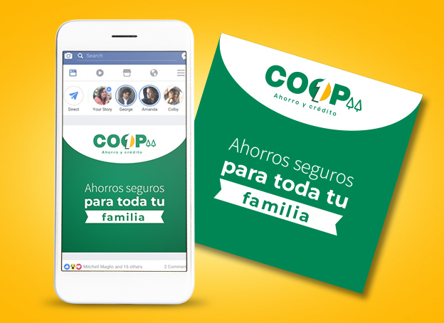
This cooperative was founded over 51 years ago, and is one of the most profitable in the country. Their members receive a higher amount of return on their investment because they have managed to build a solid company. It was founded in the No. 1 Market of Santa Ana, hence its name COOP-1. Therefore, this company was born with a complicated brand identity to communicate to their users. They use a lot of symbolism regarding cooperatives, for example, the pines that are characteristic of the financial businesses, the color green, and a motor gear, used in the industrial market.. The name played a secondary role in the past identity, and it had a basic typography, hard to remember. Reason why, they needed an innovative their branding; that would allow COOP 1 to be placed in the modern era of financial Associations.
![]()
![]()
The Pepper Solution
The first step, for Pepper's Branding team, to achieve the challenge, was the implementation of a Branding Assesment. It was identified that COOP 1 was not affiliated to any of the big cooperative groups, therefore, they were not obligated to use any of the strict graphic rules they have, for example, colors, forms etc.. For this reason, the decision was made to expand our horizons and eliminate elements, such as pines, gears and some colors. We then highlighted the brand name to make it stronger. Also a new personality was created that was much friendlier to the targets, less focused on the symbolisms of cooperatives and more attached brand values.
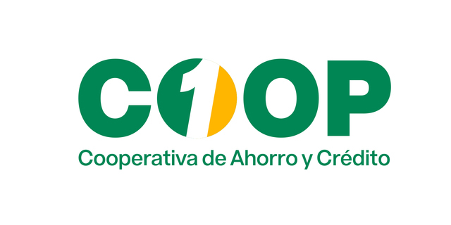
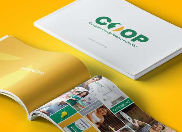
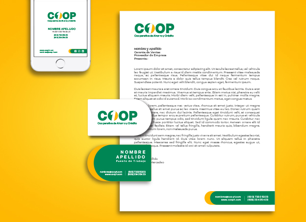
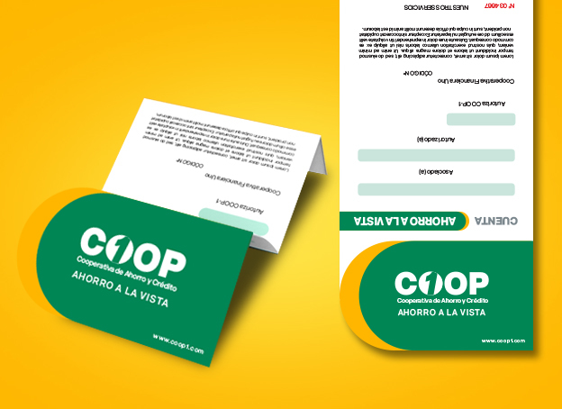
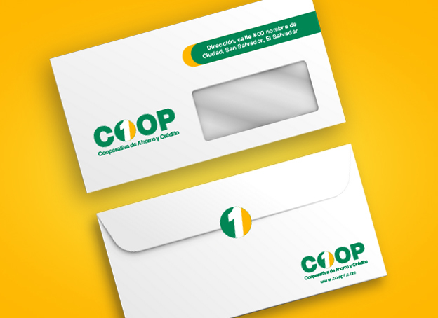
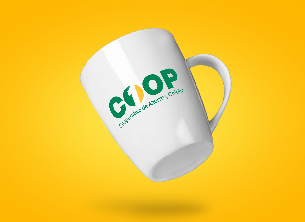
The design of the new logo was centralized in the name of the brand, therefore, a typographic logo was designed. integrating the number one to the word Coop (as this cooperative is widely known). The Isotype is one of the O´s in which the number one is integrated; and at the same time it is a yellow, white and green coin, this symbolizes savings, transparency and credit and it also indicates that it is Number One. Number one in everything, service, asociates, performance, profitability, etc. To complement the visualization of the brand, we added to this project stationary, advertising graphic line and a web look design.
Client Phrase
"Now with the change in branding we are going to be able to communicate our competitive advantage well. To be the No. 1 Financial Association known by its profitability! We have detected so far that more than 80% of our associates are very happy with the new image, since the change in branding."
Verónica Mena
Marketing Manager Coop-1
Brand: COOP 1
Client: COOP 1 de R.L.
Services:
Guapollón is a chain of fried chicken restaurants in the eastern part of El Salvador, which offers both take-out and lunch options. It is one of the few options that exist in that area.

Top Golden Events is a staff management company that aims to understand the needs of its clients to organize successful events.
Upzila is a coffee shop located in Costa del Este, Panama City. It was created with the idea of innovating and being different from the rest, through a branding that impacts its target. Its objective is to address executives and staff of large companies working in the financial center located in Costa del Este. It was conceptualized to be the first of several coffee shops located in different Panamanian business centers. With the purpose of giving people who work there or visit the building, the option of enjoying quality coffee, without the need to leave the building.
Avenida Miramundo y Calle Tacuba, Block B, No. 27, Bosques de Santa Elena II, Antiguo Cuscatlán.