The Pepper challenge
The mission was to unify these 6 companies into a single brand, taking into account the opinion of each of the partners and thus create a corporate image that could compete with regional companies or international firms.

The Pepper Solution
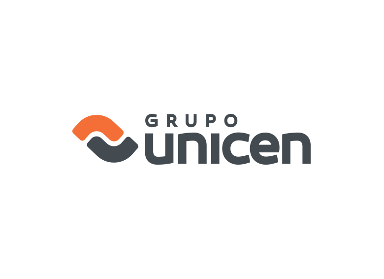
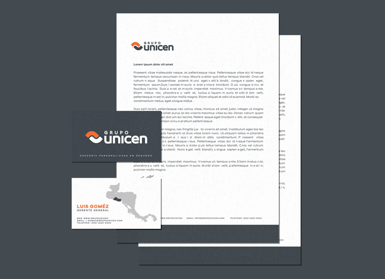
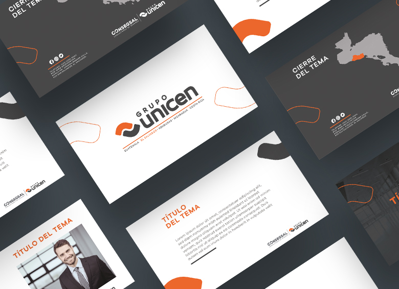
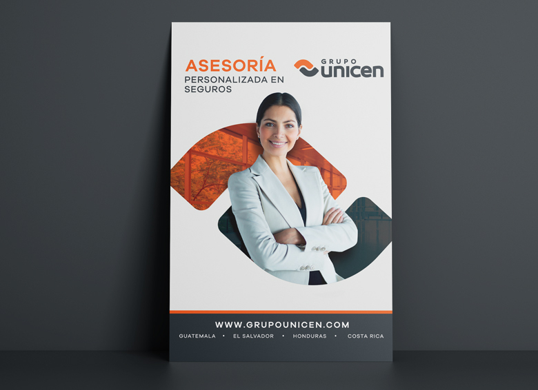
The Pepper Team made a brand analysis in order to create the new brand architecture, which included designing a new logo to represent the group of brands or companies. For the logo of the mai brand we used a minimized icon of two hands shaking, symbolizing good customer service, consulting and in general making good business deals. The use of the colors orange gray and white combine perfectly denoting solidity, warmth and confidence. Corporate graphic guide lines were also created and applied to the web design. This reflects the new brand personality, defining who they are, what they do, their values, etc. Therefore, generating the unification of the group; defining Grupo Unicen as the main brand and the other companies as members of the group.

In our client's words:
"Thanks to Pepper Design & Branding we now have a more defined brand architecture and a better graphic line capable of competing with large regional companies."
Ernesto Cano
President of Consegsal, partner of Grupo Unicen.
Client: Grupo UNICEN
Brand: Grupo UNICEN
Services: