Although the consumption of these products is high, Carvajal found the difficulty that his goal does not really recognize his brands, it was almost demonstrated that someone had eaten or drank any of his products, but without knowing what specific brand he was buying or using.
The Pepper Challenge
Redesign the brands of Carvajal products to position them and increase sales, through the design of packaging, which makes it striking enough to stand out from the competition.
It was a special challenge, because each line needed a different treatment because they were products made of different materials and required for different purposes; Then, to achieve the goal, each line was handled with different personalities.
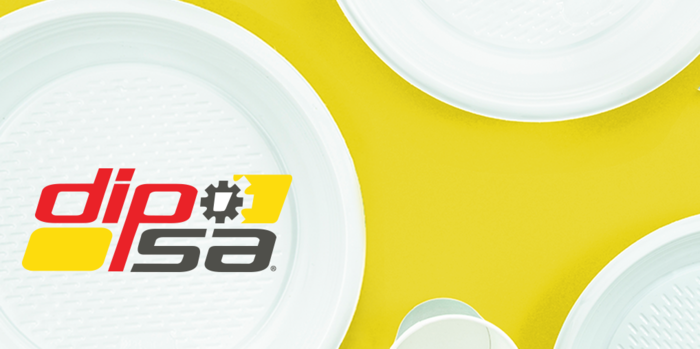
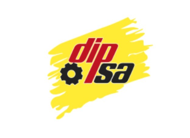
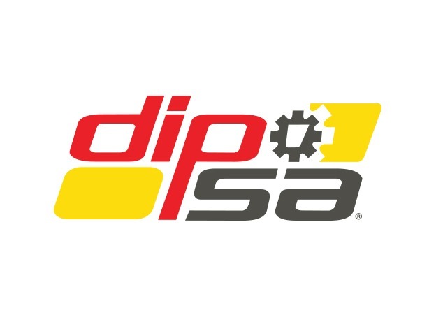
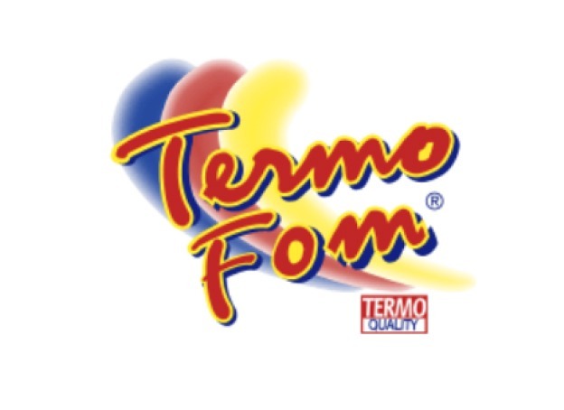
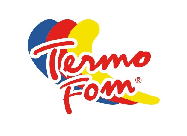
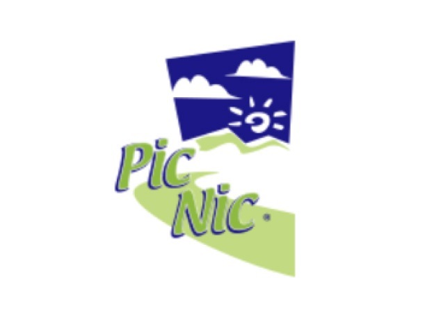
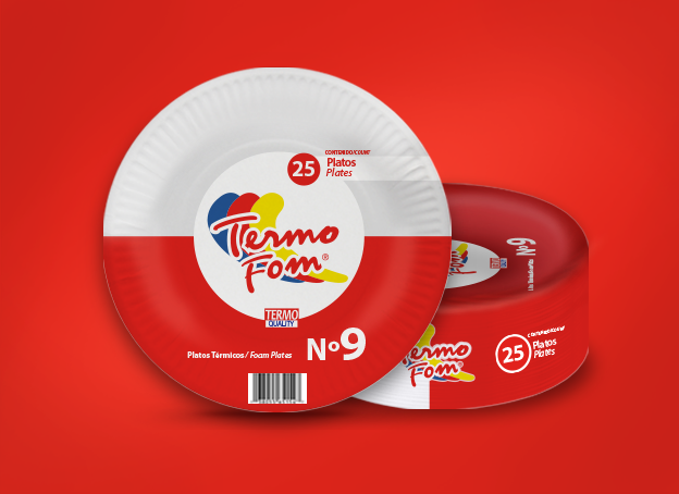
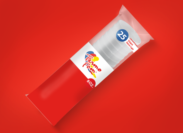
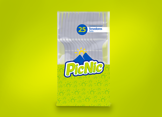
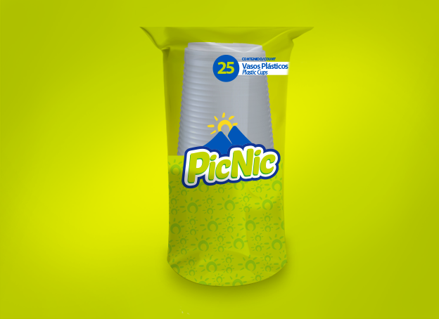
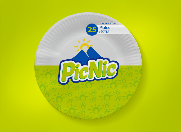
It was considered an ambitious project because it works in several brands, where three have already gone on the market, Dipsa is a very interesting case, since it was a low-cost product with a lot of demand, but without a personality that people recognize Termoform, which It is a slightly more expensive line and Picnic is the line of plastic disposables, all with great potential that had not yet been exploited.
The Pepper Solution
Refreshing each brand by improving its logos without separating from its essence, since the objective was to have brand recognition. We renew the fonts, taking them to a current level, but making them look friendlier. The new package designs will be created with a more modern format and striking colors that can be selected using the color psychology used in the fast food industry and aimed at mass markets.
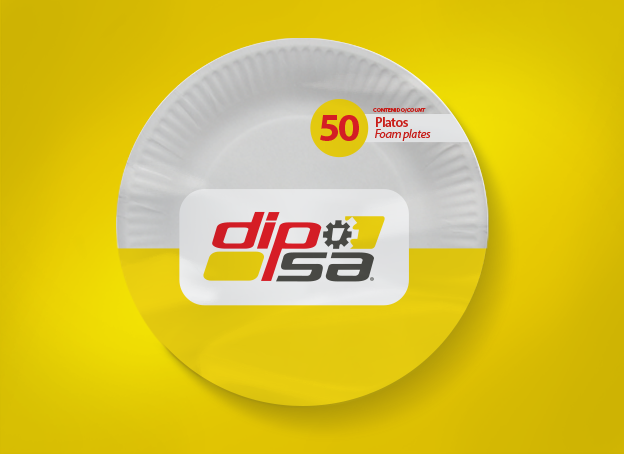
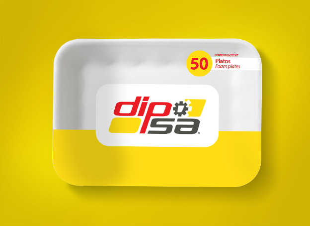
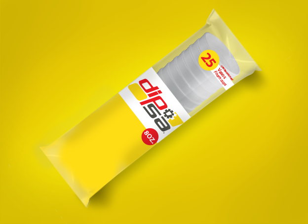
- For Dipsa, we used yellow, beacuse it expresses energy and happiness was selected.
- Termoform, we used red, to differentiate it from the others and is more associated with food. (Hunger and passion).
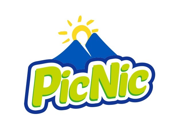
- In the case of Picnic, a combination between blue and yellow was used to result in a striking green, full of energy and hope, which made one of its most special products stand out.
The logo of each of the lines not only combines with their personalities, but together with their packaging achieve a visual impact that achieves the goal of creating effective brand recognition and increased sales.
Client Phrase:
"We have really dressed the gondolas with our packaging. our brands stand out much more, and in the modern channel we have grown 15%.”
Client: Carvajal Empaques S.A. de C.V.
Brand: Dipsa, Termoform, Picnic
Branding Project:
• Branding Assessment
• BrandBook
• Conceptualization and Packaging Design