The Pepper Challenge
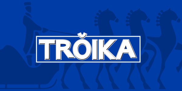
Redesigning the vignette of Vodka Troika was the main mission. We wanted to make a new design of label that was more current and cleaner to attract new market niches, mainly to young people.
The new design should be modern and dynamic; however, it was important to always maintain the characteristic aspects of the brand such as the Russian concept and the elements that constructed the brand. All this to make Toika return to the top of mind of the Salvadoran market.
The Pepper Solution
The process began with the realization of a focus group with the brand's targets to identify the new personality of the brand, redirecting it towards a younger target to position it in a more festive and nocturnal environment.
The redesign of the label, was done maintaining the essence of the brand, because it wanted to preserve the tradition and the differentiating attributes of the brand.
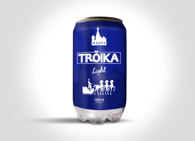
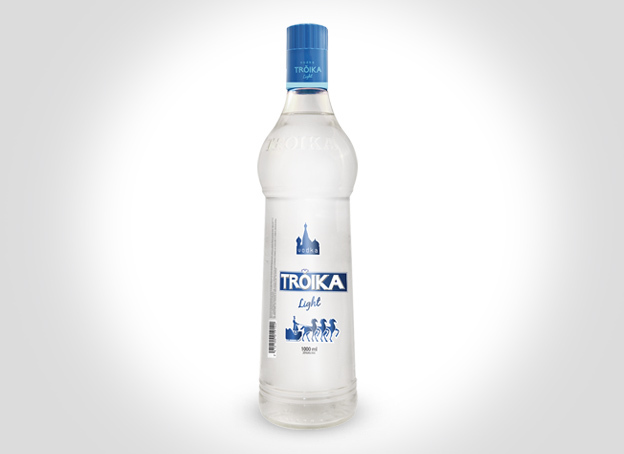
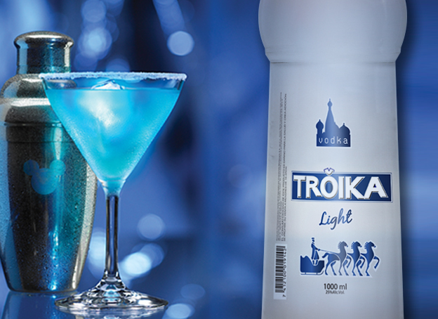
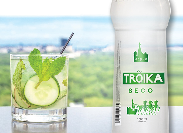
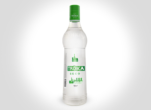
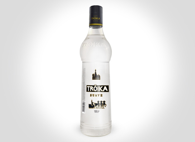
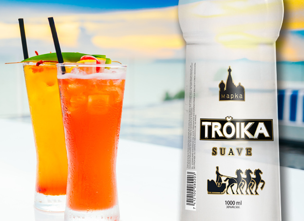
Subsequently, for the redesign of the label, we decided to use more vivid and fresh colors to attract the attention of young people. Striking colors were used for Troika light and dry Troika, such as light blue and green to generate visual impact and black was left for soft Troika, which is the most sold and represents the traditionalism of the brand. In addition to adding the brand logo and colors on the bottle cap.
Then the evaluation of the labels was carried out by means of neuromarketing tools, and after finishing design adjustments, the brand was re launched.
Client Phrase:
“Thanks to Pepper Design & Branding, we have raised our market share and are in top of Mind of our target. Now Vodka Troika has a look and feel that attracts our consumers.”
Edgar Vega
Troika Marketing Manager
Client: Disal
Brand: Troika Vodka
Branding Project: