Branding in an online store

Mi Carretilla is an online shopping site with reach throughout Central America. It was born with the idea of selling all kinds of items online at regional level.
The Challenge
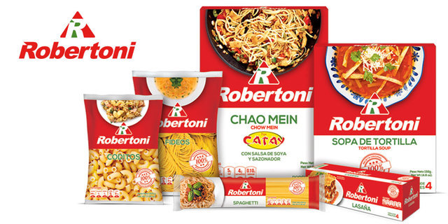
We had to revitalize the brand, because it had become generic. The market was saturated with pasta brands, Robertoni needed to stand out of the rest, and needed to increase in sales.
The Pepper Solution
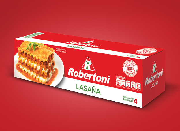
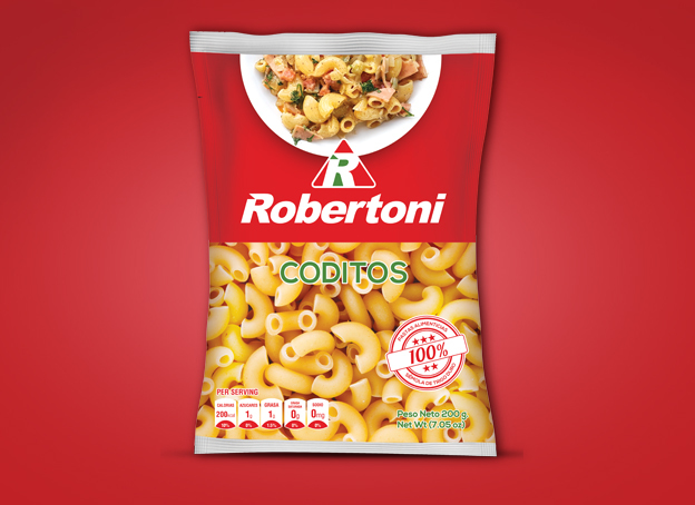
The process began with a branding assessment to find the best way to refresh the brand´s image without loosing the brand´s essence, we wanted as well, to make sure that the costumers could still recognize one of the most important graphic elements of the brand, the letter “R” from Robertoni. At the same time, needed to make it easier for the costumer to read the brand´s name. Following the in-market trends, a modern isotype was designed with the iconic letter “R, a modern and friendlier tipography was used and the colors refreshed, as they already reflect the Italian brand´s essence.
Once the logotype was changed, we created a brandbook, which guided the path to the set up of the stationary and the advertising graphic line later on, applied to the packing graphic line.
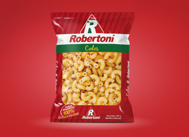
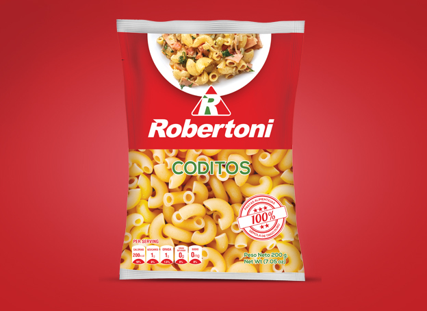
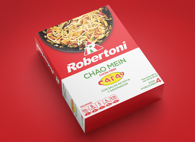
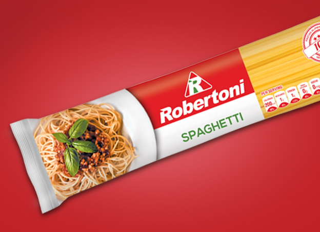
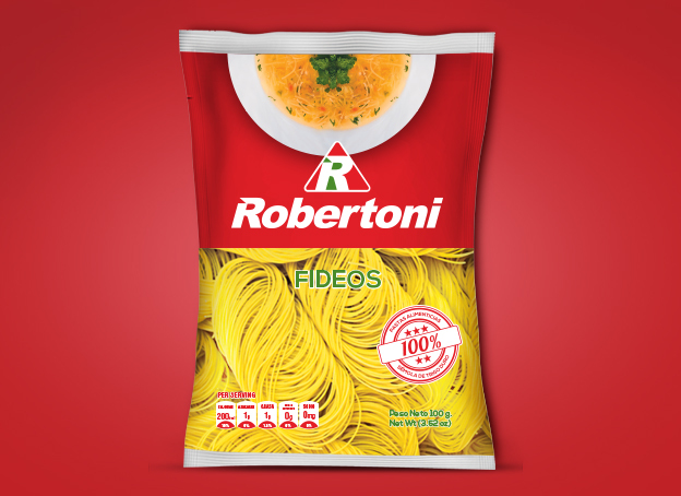
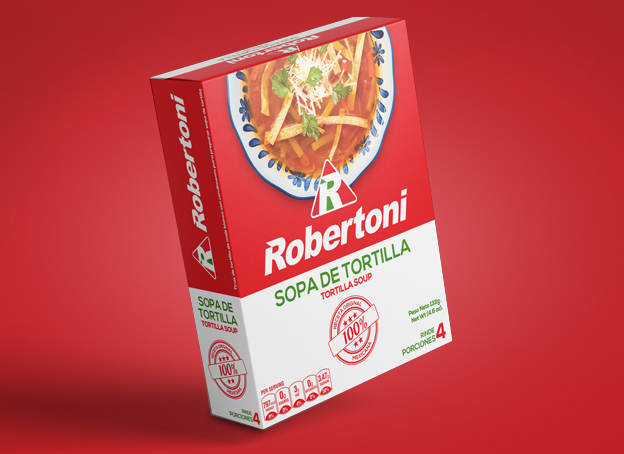
The pastas and seasoning packagiag was redesigned using the latest trends so that the product could be shown from the “top view”. This was a bold choice, due to the fact it was something very different than what the market was used to see for this type of product. Open spaces were left in the design so that the costumer could see the product. Images were also used to show what you could cook with the products.
Client Phrase
“Thanks to the renewal of the Robertoni’s packaging line, we regained our position in the market and successfully relaunched the brand. We managed to regain our market share, taking back part of the national market.”
Lic. Marco Cader. - Marketing Manager of Robertoni
Services
Branding Assessment
Advertising Graphic Line
Stateonary
Brandbook
Packaging
Advertising Campaign
Web Design
Mi Carretilla is an online shopping site with reach throughout Central America. It was born with the idea of selling all kinds of items online at regional level.
KONCEPTO is a store that sells accessories and premium furniture to decorate home spaces. It provides the latest trends in its variety of furniture and decorative items chosen with the best of tastes.

Librerías Josué was born in 1977 It’s a book store company focused in the religious literatura sale, the principal purpose is to be a pleca where people can find resourses for learn and grow in their christians values.
Avenida Miramundo y Calle Tacuba, Block B, No. 27, Bosques de Santa Elena II, Antiguo Cuscatlán.