The Pepper Challenge
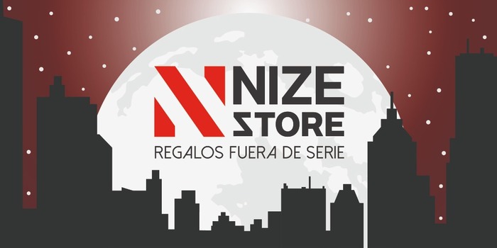
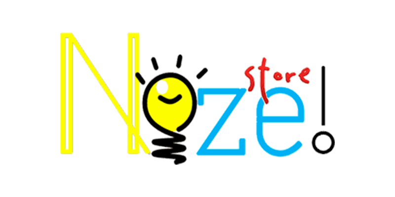
The name emerged as an analogy of a "brilliant idea" and despite of being a store with a unique and incomparable proposal, the problem was the lack of a concept on the image. The colors and shapes used in the previous logo did not facilitate the reading and the interpretation of the name was not clear, so their customers did not recognize it by "Nize Store".
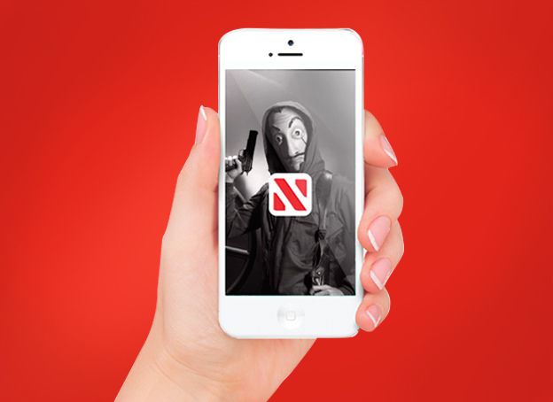
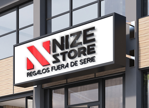
The challenge was to take the logo and redesign it, developing the concept around the series and the films that are all over the internet and transmit modernity with a new image.
The Pepper Solution
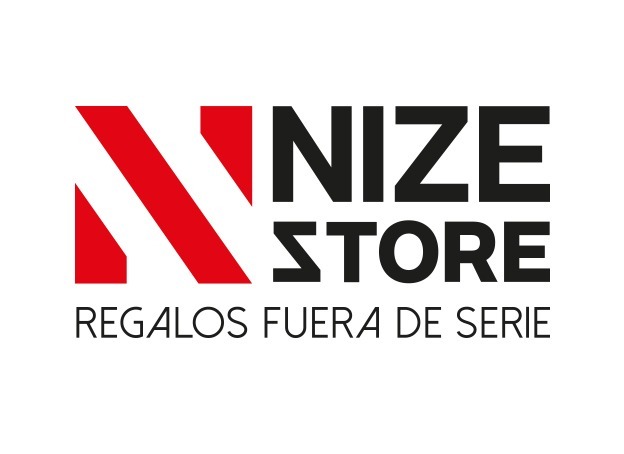
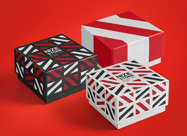
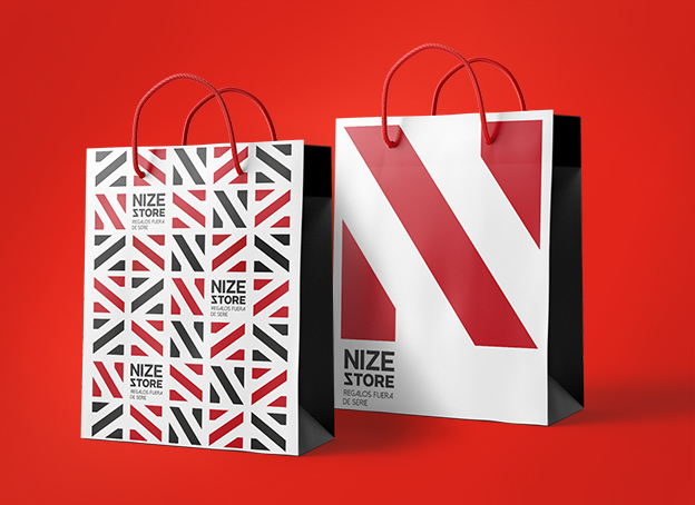
Through a Branding Assessment, new ideas and based on colors and designs that characterize the film world and the series, the new logo was created. With a unique typography, current, fresh and with personality.
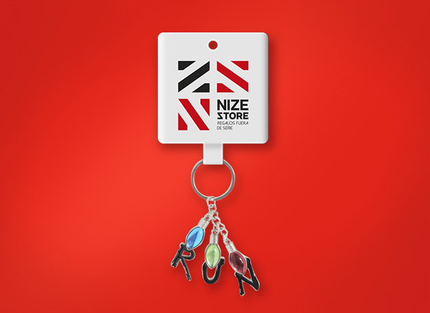
We were looking to merge both letters, N and Z in one single form, generating a red icon as a representative pattern of the brand and the slogan "Gifts outside series" that positions it with originality as a memorable brand, in the style of those unforgettable movies and series.
Client Phrase
“We have increase a 15% in our sales thanks to de branding process that was woked on our brand. The new image is much better than the old one and our clients can read it and easily interpretatem, apart from being atractive y its appeling to our customers eyes”.
Carlos Recinos, Nize Store Owner
Customer: Nize Store
Brand: NIZE STORE
Branding Project:
• Brand Analysis
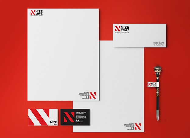
• BrandBook
• Institutional Graphic Line
• Publicity Graphic Line
• Store Concept