The Pepper Challenge
Under the vision of being a company for the construction market, Ferretería La Estrella was born on June 1, 2001 in Zacatecoluca with three branches distributed in the eastern site of the country: Zacatecoluca, San Vicente and Jiquilisco. With the purpose of refreshing its logo and a having greater presence in the construction sector, Estrella turn up to Pepper, our agency to renew its image.
Through an analysis of the brand, our creative team found the opportunity to redefine the identity of Ferretería la Estrella by creating a modern and impressive graphic line that adheres the demands of its customers.


The Pepper Solution
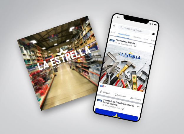
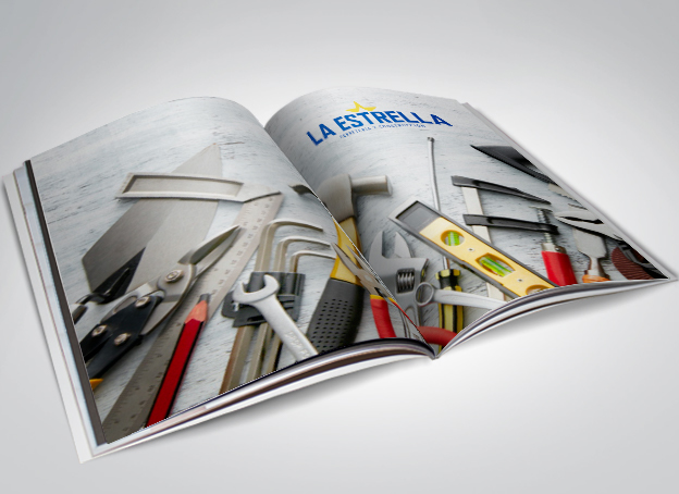
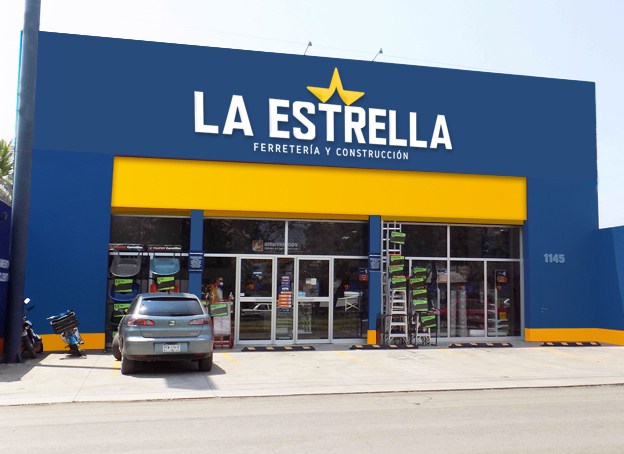
The logo idea was originated from a freehand drawing highlighting the star icon and a readable font. The characteristic elements: colors and the star, giving it a modern touch that transmits strength and visual power and this elements were also emphasized in the design. The typography was handled in a modern trend and with sufficient thickness to show robustness and strength, characteristics of the construction category. The color palette used, was strategically made to draw attention: blue, yellow and white. This in order to differentiate from the competition. An imagotype of a half star was used to make sense of the business name.
Ferretería La Estrella is currently recognized in the eastern area as a trustworthy company for every merchants who work in the construction area, fixing houses or offices.

The Client Phrase
We like the new image because it has more life. From having a somewhat informal image we became a strong company thanks to the unification that Pepper Design & Branding made with our logo. We have seen more expectation and positioning in the construction market. Our clients recognize the logo in all the littoral providing security and our workers feel belonging to the company. Now we have almost 50% increase in our sales and people already recognize La Estrella throughout the Litoral.
Fátima de Cortez, Ferretería La Estrella Manager Administration
Customer: Ferretería La Estrella
Brand: La Estrella
Rebranding Project:
⦁ Brand Analysis
⦁ Logo Refreshment
⦁ Institutional Graphic Line
⦁ Application for use in signs